Analysis of Major Peace Talks Between Israel and Palestine (1993-2003)
The Arab-Israeli Conflict has a history as long as it is complicated. Many different factors have played a role in promoting cooperation, as well as polluting any advancement towards a permanent solution. To what degree, however, have the very talks themselves been the preventer of peace? This project will analyze five of the major peace talks that have taken place between Israel and the representatives of Palestine, specifically focusing on their discussion of cooperation and peace, as well as actions taken towards a liveable and sustainable solution.
Note: These specific peace talks were chosen based upon their perception in both the media, as well as history, as being some of the most ‘influential’ in advancing the path towards peace and a final solution to the Arab-Israeli Conflict.
(To operate Prezi, use left and right arrow keys to move freely through the presentation)
A New Beginning? The Path of the 1990s
“Oslo Accords: A Secret Path to Peace”
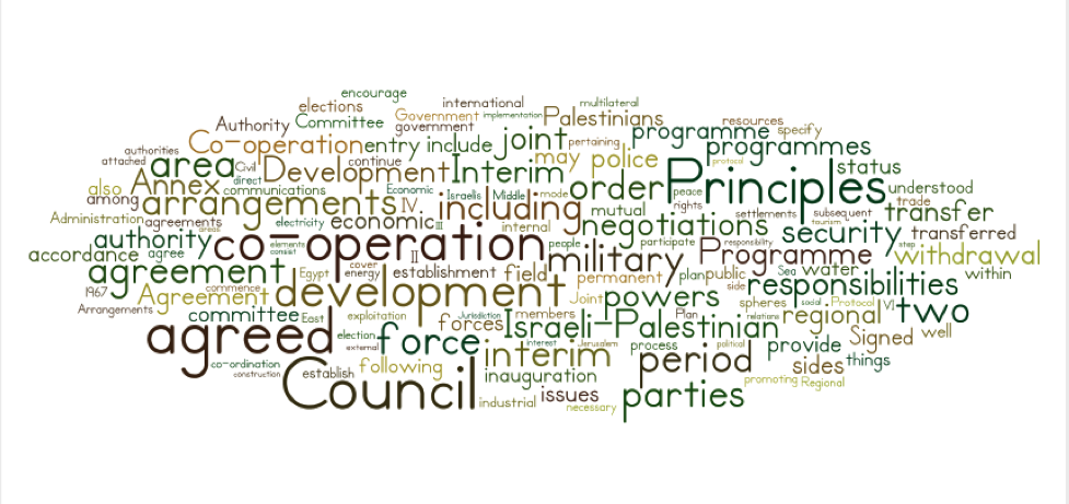
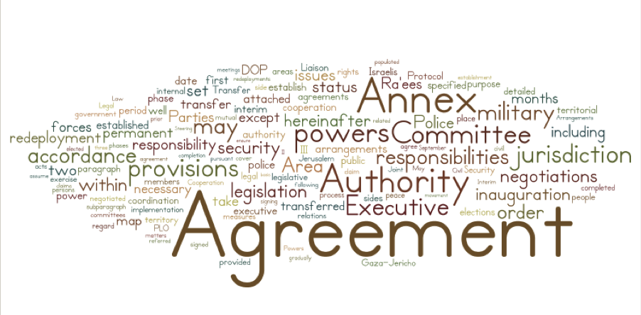
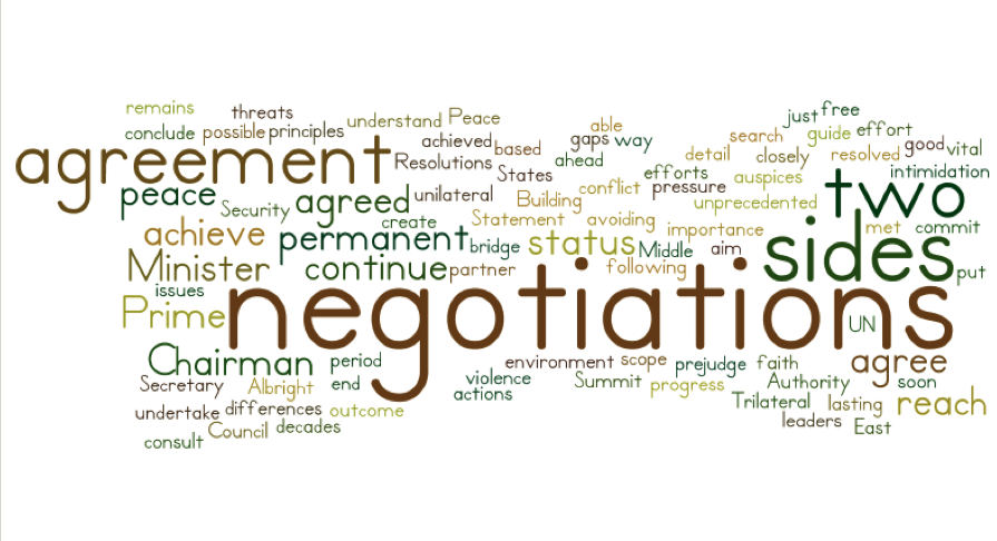
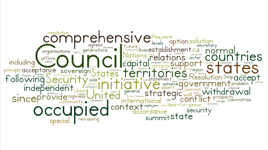
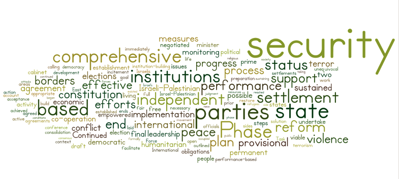
Slides #3 to #17 cover the peace talks most commonly referred to as the Oslo Accords (broken into two separate discussions in the Prezi, combined in one discussion here) historically documented as Declaration of Principles on Interim Self-Government Arrangements). As slide #3 indicates, the Oslo Accord I was the first of the Oslo Accords, signed in 1993 in Washington, D.C. Present at the signing of the document that correlated with the Oslo Accord I peace discussions were American President Bill Clinton, Israeli Prime Minister Yitzhak Rabin, and Palestinian Liberation Organization (PLO) leader Yassar Arafat. In analyzing the written document unfolding the secret peace talk, I made use of the word graphing tool Voyant & Wordle. My goal with this visualization was to highlight the words most used throughout the whole document. In order to make the data more applicable and relevant, I created a specialized ‘Edit Stop Word’ list, which eliminated the commonly found words, such as articles and conjunctions, as well as words which would occur frequently in an official document (such as article, section, as well as others). What resulted was the following Wordle word visualization (depicted on slide #4):
Oslo Accord I (1993)
Oslo Accord II (1996)
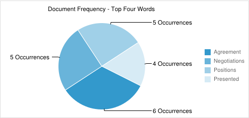
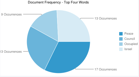
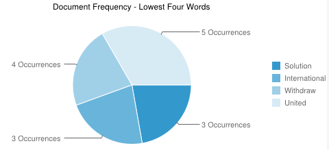
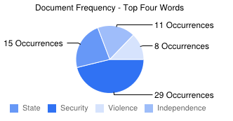
As can be expected, some of the largest words (prior to me removing them) were the names of the territories involved, including West Bank, Gaza, Palestine. What was initially interesting to me was that Israel was much smaller in the chart in comparison to its counterpart in the talks (Palestine). During this peace discussion, however, the territories most focused on were those traditionally under Palestinian control, West Bank and Gaza. This would explain the vast difference in size. After this initial, ‘first glance’ view of the chart, I used the more detailed word charting and frequency tools offered on Voyant to create my own chart of the four most frequently used words and the four least frequently used words. In creating this chart, I was overwhelmed at first with the sheer size of the word list given to me by Voyant. There were many words on both sides of the spectrum, and taking the four greatest or least used words would have provided no real analytical data, nor would my chart have been very useful, as most of the top or bottom four words had the same exact frequency. Having decided that this route was not the best for my personal uses, I decided to chose the top four and bottom four words that in some way, either connotatively or denotatively, related to peace or collaboration. With this in mind, I went through the frequency chart again, this time with much better results. Depicted below is the final chart for the top frequency words of the Oslo Accord I document (depicted on slide #5):
As shown above, I chose to use a pie chart to relay my data. The reason for this choice was to show visually which words dominated the document, and to what degree. The words that I chose for this chart I listed to the right, and are color-coded to the section of the pie chart that represents them. In addition to this, I also included the number of occurrences for each word. To get a better idea of the significance of these words and their frequency in the document, the highest number of occurrences for any word was 38, just 8 more times than the highest frequency word charted above. Also important to note is the length of this document, which was fairly substantial at seventeen articles and four annexes (or additions). The reasoning behind this chart was to create a visual piece of data that recorded how often words associate with peace and collaboration were included. This piece of information, along with the next chart to be explained, will help to track the use of like-minded words throughout the remaining four documents to be analyzed.
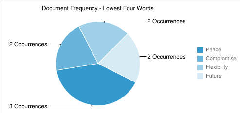
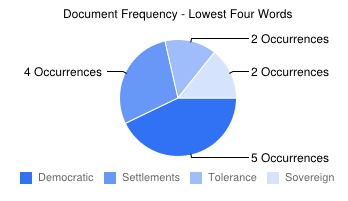
The next chart that I made was the bottom four frequently used words. In creating this chart, I had the same things in mind as I did for the top frequently used words. Because I wanted to not just chart how often peace-related words occurred, but how infrequently they occurred, I used the same Voyant tool to go through the data for frequency, this time focusing on the lower frequency words. As can be expected, there were many that were used infrequently, but not for reasons that would lent themselves to being analyzed (such as ‘article’ or ‘purpose’). So, just as with the previous chart, I went through the lowest frequency words searching for ones that had to do with peace or collaboration. Below is the final chart for the lowest frequency words for the Oslo Accord I (depicted on slide #6):
Keeping with the previous data, I again placed the information I gathered into a pie chart for visual analysis. As with the previous chart, I focused on those words that either directly or indirectly related to peace and/or collaboration. The words that I found are depicted in the chart to the right, and are color-coded to correspond to their respectful representations. In addition to this, I again included the number of times these words occurred throughout the whole document. Again, it is important to note that the highest frequency word occurred 38 times, giving a bit of a frame of reference for these words, which only occurred a handful of times.
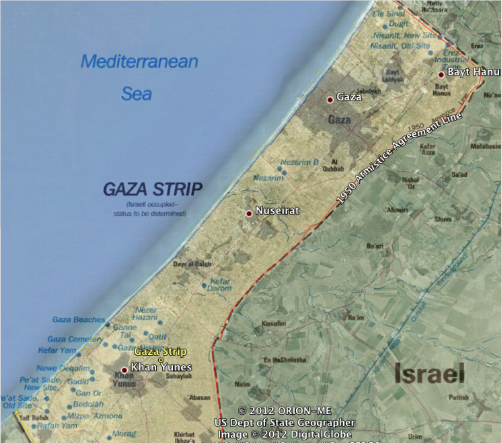
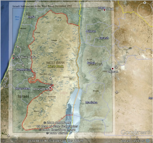
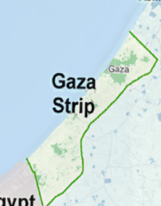
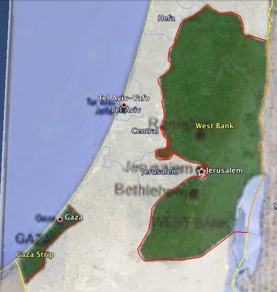
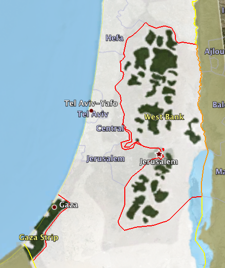
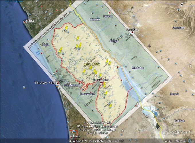
As well as giving an analysis of the words of the document, I also wanted to include a visualization of the geographical impact of each peace talk discussed. In this specific peace talk, as with others to follow, the areas of West Bank and Gaza were the main interest in terms of territory division. In order to show the territorial changes made after the first half of the Oslo Accords was enacted, I used Google Earth to overlay an historical map depicting the changes made to the areas of West Bank and Gaza. Depicted below is the mapped overlay of Gaza Strip (slide #8):

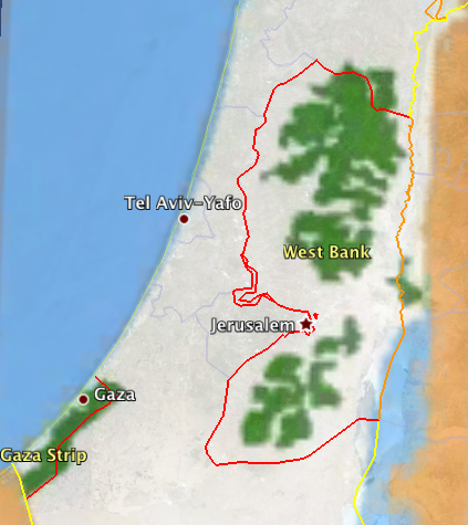
Also included on slide #9 is a close up image of slide #8, showing the specific Israeli settlements:
As indicated in the textual explanation on the Prezi presentation, this image overlay includes the Armistice Line of 1950, depicted in red, which runs along the west boarder of Gaza. This line was not altered during the Oslo Accord talks. Also included on this overlay are the Israeli settlements, both previously existing and those created after 1993 at the close of the first Oslo Accord peace talks. The main purpose behind including this map was for the visual data of settlements and markings of territorial lines to act as a guide or comparison for the maps to follow, in which changes in both settlements and territorial lines will occur.
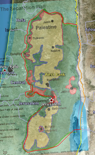
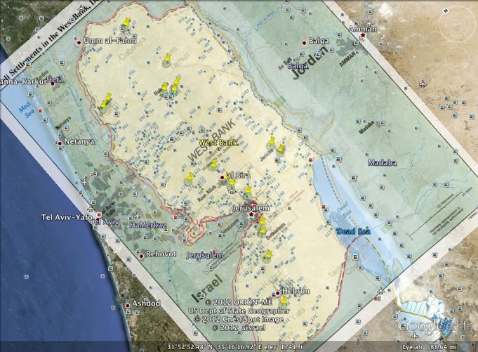
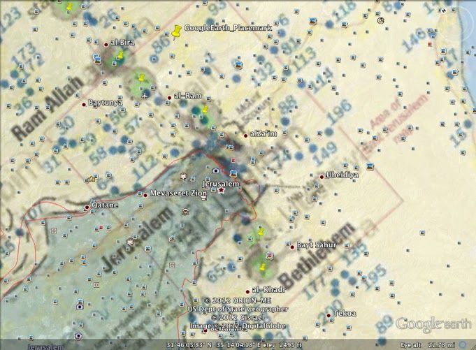
To also give a guideline as to the changes that will occur over time in the area of West Bank, I included a Google Earth image of that territory as well. As before, I included an image overlay of a map dated December 1993, the same date as the Gaza overlay map, to depict the reality of territorial lines and settlements existing at the close of the first set of Oslo Accord talks. Depicted below is the mapped overlay of the West Bank (slide #9):
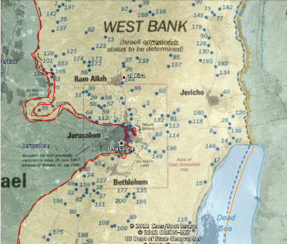
Also included on slide #11 is a close up image of slide #10, specifically the densely population Jerusalem area, showing the specific Israeli settlements:
View Google Earth Presentation Here (To start the presentation, click the link given on the browser that appears and open the file downloaded to your computer – if presented with an option, open with Google Earth). This gives a close up tour of the two map overlays, looking at specific areas of high settlement population.
Take Two: A New Millennium for Peace
“The Unraveling of Oslo”
The next set of slides (#20 – #27) analyze the data from the Camp David Summit of 2000. As slide #21 states, the Camp David Summit was meant to be a continuation of the Oslo Accords, at the prompting of U.S. President Bill Clinton. Prior to the start of the Summit, the Israeli Prime Minister Yitzhak Rabin was assassinated, and was replaced by Ehud Barak. Another complication for the Summit was the lack of confidence on the part of then PA Chairman Yasser Arafat. Arafat was convinced that the Summit was being convened too early, as the Oslo Interim process had failed to fulfil either Israeli or Palestinian expectations. Despite these reservations, the Summit convened on July 11th and ended Juy 25th without an agreement. Instead, a Trilateral Statement was issued, which defined the agreed principles to guide future agreements between the two parties. It is this statement that comprises the whole of the Camp David Summit documentation, which is used to compose the word charts in slide #22-24. It is important to note that the Summit talks were based upon an all-or-nothing approach, where all parties had to agree to every part of a proposal to make it legitimate. A far different approach than was taken in the Oslo Accords, the talks were an international disaster, which is reflected to a degree in the data from the word diagram and charts.
With the word diagram, shown on slide #22, I again created an ‘Edit Stop Word’ list, which included common words in English, as well as terms that would most likely appear in a peace document, such as shall, article, and others. This created a word diagram that showed a large portion of peace-related words, including negotiations, peace, agree, and achieve. However, upon closer inspection, the relative size of these words is due to the size of the document, rather than their excessive use in the document. In comparison to the word diagram from both the Oslo Accord I and the Oslo Accord Interim Agreement, this diagram fewer occurrences of peace-related words, by a degree of more than half. In addition to this, new words with a negative charge or connotation were added in this document as opposed to the previous documents. These words include pressure, intimidation, and prejudge. In relation to the larger words presented on the diagram, these words had a frequency with only a small percentage of difference, meaning that the words presented as larger in the diagram were often discussed almost as much as those presented as smaller.
The specific word pie charts created from this information display similar findings. The first pie chart, located on slide #23, shows the most frequently occurring words in the document:
Immediately in comparison to the graphs from the two Oslo Accord documents, there is a huge difference seen in the number of occurrences of peace-related words. If you recall from earlier in the presentation, occurrences of these types of words were charted at a frequency between 20 and 30 on average. While this in part has to do with the length of the document, as discussed previously, it also alludes to the lack of real content in these talks. Given that the discussions ended without any real resolution, its fairly easy to conclude that the Trilateral statement made little headway in terms of real progress. Also, the words that had the highest frequency here are used to discuss what actually took place in the talks, not what the two parties hope will come to pass, or what each party is working towards, as was the case with the Oslo Accords. This also fits, as the Trilateral statement was more a set of guidelines to future peace talks, rather than any movement towards peace, as was it’s original intent.
In addition to charting the higher frequency words, I also charted the lower frequency words, following the same format as previously used with the Oslo Accords. This chart is displayed on slide #24:
 As was the case with the previous chart, the frequencies here are also less than was seen in the Oslo Accords. Whereas the lower frequencies started around 7 to 5 in the Oslo Accord charts, the frequencies here with peace-related words started at 3 and continued downward. What came as the largest surprise to me in compiling the list of lower frequency words was the amount of words gathered that had previously held a higher frequency in the Oslo Accord Charts. Two words in particular from this chart that occurred at a much lower rate than expected were compromise and flexibility. In the previous Oslo Accord charts, these words, or in some cases their synonyms, were among the higher ranked frequencies, some with numbers as high as thirty. Now, just four years later, they had almost completely vanished from discussions.
Following the same format as before, I also mapped out the territory lines from the year 2000, specifically after the Camp David Summit ended, to get a better picture of the physical changes, if any, the Summit had. The first map pictured is of the West Bank area (displayed on slide #26):
 In this map, as explained in slide #25, the areas of Palestinian locality are represented by the light green areas, the areas of Israeli long term lease are in dark green, the areas of Israeli locality are represented by light blue, and the areas of Israeli annexation are in dark blue. Before analyzing this map in relation to the Oslo Accord maps, its important to understand what was asked for by Chairman Yasser Arafat, what was offered by the Israeli Prime Minister Ehud Barak, and what was actually done territorially. In the discussions at the Summit, Arafat indicated that Palestine wanted either full control over all of West Bank and Gaza or a one to one land trade with Israel. However, Barak offered to form a Palestinian state comprised of 73% of West Bank (27% less than what was desired) and all of Gaza, a territory considered less of a focus for Israel. This would mean that Israel would have to withdraw from 63 formed settlements in West Bank. Taking this map in comparison to the Oslo Accord maps, it is clear that the number of Israeli settlements (indicated by the areas in light blue) did not diminish, but rather stayed consistent and even grew in certain areas of West Bank (as compared to the blue dots and/or triangles that represent the settlements in the Oslo maps).
In addition to the West Bank map representing post-Camp David territories, I also created a Google Earth overlay of Gaza Strip (displayed on slide #26):
As noted in the previous paragraph, the dark green areas represent what Barak was willing to annex to the Palestinians, and the light green the areas already populated by the Palestinians. In contrast to the West Bank geographical data, the Gaza strip data holds closer to what was offered by the Israelis.
To get a better grasp of the lack of removal of the Israeli settlements, here is a line graph to display the geographical information:
 As noted in the graph, the data points for the West Bank settlements rise from 1993 to 2000 at a rather sharp rate, increasing by approximately 100,000, rather than decreasing, as the Israeli offer indicated it would.
View Google Earth Presentation Here (To start the presentation, click the link given on the browser that appears and open the file downloaded to your computer – if presented with an option, open with Google Earth). This gives a close up tour of the two map overlays, looking at specific areas of high settlement population and the annexation plan proposed in the Camp David Summit.
Aid From the East: The New Millennium Continues
“The Arab Peace Initiative”
As indicated in the presentation, the Arab Peace Initiative was an attempt at presenting a resolution to the Arab-Israeli conflict from the Arab world. The Initiative was prompted by Saudia Arabia from then Crown Prince King Abdullah, and was later agreed upon by the Arab League in 2002. This initiative, as with the previous peace talks, attempted to normalize relations betweent he entire Arab region and Israel. However, this plan also called for complete withdrawal from the occupied territories in both West Bank and Gaza, and a settlement of the Palestinian refugee crisis, based upon the U.N. Resolution 194.
This Initiative met both praise and criticism from both sides, the largest complaint being that the initiative was a ‘non-starter’ and would do little towards reaching a lasting peace (especially given that Israel was not included in the discussion). Greater than this complaint, however, was the refusal to accept the Initiative in its full by the Israeli government based upon the inclusion of the U.N. Resolution 194, which is the basis for the Palestinian refugee ‘right to return’. While Israel was not rejecting the inclusion of normalization between the two parties, the demands asked for by the Arab League were not accepted. Due to these criticisms as well as growing violence in the region, the Initiative was stalled until 2007. At its restarting, King Abdullah called for an end to the Israeli blockade on Gaza, as well as the ability to establish a special committee, composed from members of the Arab League to work with the U.N. on achieving a lasting peace. Currently, the special committee to the U.N, which is comprised of representatives from Egypt and Jordan, began talks in 2009 to amend the initial Arab Peace Initiative that would demilitarize the future Palestinian state, as well as prevent the right of return to areas designated as Israeli territory. This plan has also been recognized by the Obama administration, who has encouraged Israel to accept.
Now that a brief summary of the Initiative has been given, what follows is an analysis of the data associated with it:
To start with, I created a word diagram of the Arab Peace Initiative document. The visual diagram (displayed on slide #30) is pictured below:
Following the same line of analysis as the previous peace talks, I created pie charts of the highest and lowest frequency words. Below is an image of the top frequency word chart (displayed on slide #31):
The words revealed in this chart are both revealing and provoking. In comparison to the document analysis from the Oslo Accords and the Camp David Summit, the Arab Peace Initiative is the first talk reviewed thus far that has the word ‘peace’ included in the top frequency list. In the instances that peace is discussed, the majority pertain to finding a comprehensive peace in the middle east, with the remainder, a small majority, referring to the title of the Initiative. In the previous top frequency charts, words relating to cooperation and working together have made the list, but peace has been elusive. The inclusion of the word ‘Israel’ in the top frequency was also interesting from an analysis point of view. In the previous peace talks, Israel has been an active participant in the discussions taking place, and while it has been included in the top frequency chart, its inclusion in this chart is interesting because Israel was not present for the discussion. In the instances where Israel is mentioned, the Arab Peace Initiative is calling Israel to agree to certain terms towards a lasting peace, as well as urging Israel to accept the Initiative. In previous peace talks, Israel has been present and their inclusion in the documents is in reference to the government of Israel as a title, as well as current actions, rather than what Israel is willing to concede to. The Arab Peace Initiative takes a turn away from this status quo, although Israel refused to recognize this step.
In addition to the top frequency chart, I also included a low frequency chart (located on slide #32), which is displayed below:
 The low frequency chart for this document was also very interesting. As with the Camp David document, the frequencies are lower than those seen in the Oslo Accords due to the shorter length of the document (only slightly longer than the Camp David Summit). Two words that I specifically found to be interesting were ‘international’ and ‘solution’. Looking first at ‘international’, the lower frequency in this document is interesting due to the former role that the international community played through the U.N. as regards involvement in the peace process. In this process, however, the main party involved in the Arab League, which is comprised of 22 Middle Eastern countries. This is not to say that the U.N was removed entirely (as seen in the brief overview, one of the goals of the Initiative was to create a special committee to work with the Security Council of the U.N.), but it did not have the same mediating role as seen previously.This lack of extreme presence in the talks also took a toll on the acceptance of the Initiative in the international community, and potentially played a role in the slow movement of the Initiative, which did not take action till four years after it was convened.
After analyzing the text itself, I also chose to take a look at the territorial impact, if any, the Arab Peace Initiative had on the areas of West Bank and Gaza. As explained earlier, one of the Arab Peace Initiative’s main requests of Israel was to create a Palestinian state that reflected the 1967 territory lines. Reflected below is a Google Earth overlay image of the 1967 territorial divisions (displayed on slide #34):
In the map overlay above, the dark green areas, which comprise all of West Bank and Gaza (with the exception of Jerusalem), represent Palestinian territory. The white (or off-white) areas, including Jerusalem, represent Israeli territory. It is these territorial divides that the Arab Peace Initiative was desiring to return to in exchange for a normalization of relationships between Israel and the Arab world.
By itself, this map does not say very much about the effectiveness of the Initiative, only what was asked for. The map below, which shows the territorial divides as of 2007, when compared to the previous map, reveals the outcome of the Initiative (map displayed on slide #35):
 Using the same legend as the previous map, rather than diminishing their influence in the West Bank and Gaza, Israel only continued to expand, taking ver previously Palestinian-held territories. As is easily inferred, the Arab Peace Initiative did not receive anywhere near what they asked for. Consequently, the security and recognition promised to Israel in exchange by the Arab League has not been seen either, resulting in another missed opportunity for peace, as the Initiative has had little impact in the time since its convening ten years ago.
Mapping Out The Future: The Bush Administration
“The Road Map For Peace”
The final peace talk being analyzed in this presentation is the Roadmap for Peace, established in 2002 by then U.S. President George W. Bush. The Roadmap for Peace, similar to the Oslo Accords, was meant to be a framework for negotiations rather than a negotiation in itself. The Roadmap, in fact, became seen as a replacement for the failed Oslo Accords (which fell apart in 2000) by the international community. An important note that differentiates the Roadmap from the Oslo Accords is the needed establishment of the goal of a two-state solution prior to negotiations (meaning that both Israel and Palestine would have to recognize before entering talks the goal that each party be recognized as a sovereign state).
This framework was designed with the goal of a Palestinian state in mind, as well as the dismantling of Israeli settlements and the curbing of terrorist violence by Palestine. The Roadmap for Peace was created with three phases, ideally to be complete by 2005 (a timeline of three years):
- To end violence between Israel and Palestine, freeze Israeli settlement building in the 1967 Palestinian territories of Gaza, West Bank, and East Jerusalem, and strengthening the Palestinian Authority as the government of Palestine
- The creation of a Palestinian state with temporary borders
- Finalizing permanent borders for a Palestinian state and unilateral recognition of the states of Israel and Palestine.
Two words specifically within these data points that I found to be interesting were ‘settlements’ and ‘tolerance’. Turning first to ‘settlements’, its position among the lower frequency words within this document specifically was rather surprising. As noted earlier, one of the main stipulations for the implementation of the Roadmap framework was the dismantling of Israeli settlements in West Bank, Gaza, and East Jerusalem. While this is stated as an important first step to possible peace, the issue is only addressed directly four times within the document. Looking once more to the line graph of Israeli settlement building (found under the Oslo Accord section), this vital portion of the Roadmap framework was blatantly ignored in West Bank and Gaza, and was only slightly adhered to in East Jerusalem. This could be due, in small part, to a lack of emphasis within the framework of the vital importance of this point (coupled, obviously, with the conscious actions of the Israeli government). The term ‘tolerance’ was also a word that took a back seat in this document. One of the main reasons that this data point was so surprising to me was the new focus on a two-state solution. With this framework in mind, it would become extremely important for both Israel and Palestine to live in peace with one another and to act tolerantly towards each other. Aside from fighting over the same pieces of land, the two parties share different religions, cultures, and histories. These facts make it complicated at times to live respectfully with one another. Tolerance in this case especially is needed for peace to become a reality.
In order to analyze the territorial data related to the Roadmap for Peace, I created Google Earth overlay maps of the West Bank areas from 2003 and 2012. Below is the overlay image for the 2003 map of West Bank (located on slide #42):
In this map, the areas in beige are under Palestinian control, while the areas in green are under Israeli control. Also included in this map are areas shaded in red. These areas represent Israeli settlements that were currently being constructed in 2003, or were being lobbied for construction. As noted earlier, one of the conditions of the Roadmap for Peace was the immediate dismantling of Israeli settlements. These areas especially will be important in analyzing the second map.
The second map needed to properly analyze the lack of progress in the two-state solution is a map of current day West Bank, Gaza, and Jerusalem displayed below (located on slide #43):
 In this map, the dark green areas represent Palestinian territory, while the gray or white areas represent Israeli territory. Looking back to the previous map, it is clear to see that the Palestinian territory and shrunk substantially, being engulfed into Israeli territory. In addition to this, a majority of the red spaces in the previous map denoting settlement areas have now been deemed Israeli territory, meaning that their construction has been completed. Referring back to the Israeli settlement line graph included in the Oslo section, it is clear that Israeli settlement expansion, rather than halting, was actually expanded over the period of the Roadmap for Peace.
View Google Earth Presentation Here. (To start the presentation, click the link given on the browser that appears and open the file downloaded to your computer – if presented with an option, open with Google Earth). This gives a close up tour of the two map overlays, looking at specific areas of Palestinian and Israeli territories as proposed in the Roadmap for Peace.
Conclusion
From the maps and documents analyzed in this presentation, it is clear that no solution has been made as regards a permanent statehood solution. What has not always been as clear is what role the peace talks themselves have to play in this lack of progress. While the documents analyzed revealed that the focus was not always on statehood or cooperation, the talks themselves are not entirely to blame. Rather, it is the failed follow-up on the parts of the mediators and the participating parties themselves that have led to the stagnant pace of peace. Failure to abide by agreed frameworks and stipulations has, and will continue to, stall a lasting solution, regardless of the solutions presented or their support in the international community.
Security Preservation Plan
Having completed my presentation, it is also important to provide a plan for the security and preservation of my work over time. The following are that ways in which I would provide for these aspects of my project:
Preservation –
- Posting the project online: this could include creating my own website to host the information (which would involve having to secure a domain name, as well as choose which form I would like to create my site in – .edu, .com, etc). Because this would take more creation and maintenance on my part, I would choose instead to post my presentation on some sort of online journal or pre-existing educational or governmental website focused on the subject. One site that came to mind was Jadaliyya, which focuses specifically on the Middle East. Because this site also presents information in Arabic as well as English, I would have the potential to translate my presentation to expand my audience and provide for preservation for two audiences.
- Consulting Better Resources: one aspect of this presentation that frustrated me was the lack of useful or detailed maps on my area of study. The maps found were, for the most part, simplistic or poorly pixilated. One aspect of preserving my project that I would look into is exploring further the academic community on this subject in search of a larger wealth of maps on the area. Also, with more time devoted to preservation, I could use map programs, such as Google Earth, to create my own maps that better reflect the data and research.
- Maintaining Presentation Software: lastly, I would have to ensure that I kept up my Prezi presentation, which is linked to in this blog. Because I was new to Prezi and much of the information included in my presentation was media-based, it would be important for me to ensure over time that any problems I ran into during the creation of my Prezi were resolved and did not reoccur (as happened often in creating my presentation). Also, some of the information in this blog post is linked to other webpages and interactive visuals. I would need to ensure that these links stayed active over the course of my project’s use.
- Citations: one aspect of security would be to ensure that I cited the sources used in the making of this presentation (which I have included below). This would ensure that those sites and authors that I gathered outside information from would be properly cited and receive credit for their findings. This would also protect me from any accusations of plagiarism or copyright infringement (should my work be used solely for educational purposes).
- Publishing my Presentation: another aspect of security would be to publish my presentation in the form of an essay or written work that would accompany my presentation (such as this blog). By publishing this work in an academic journal, I would be able to ensure that information that is my own would be credited as such.
- Passwords: a final aspect of security for my presentation would be to ensure that sources on the Internet that are linked with my presentation are password protected. This would include my Prezi account, as well as my blog account information. In order to best protect these sources, I would need to ensure that I changed my password every 3-6 months, and used a password that is comprised of characters that are not easily guessed by hackers.
Works Cited
The following is a list of websites and/or documents used in the making of this presentation:
Oslo Accord Sources
- http://news.bbc.co.uk/2/hi/in_depth/middle_east/israel_and_the_palestinians/key_documents/1682727.stm
- http://www.globalsecurity.org/military/world/palestine/images/west-bank_settlements_dec93.jpg
- http://www.globalsecurity.org/military/world/palestine/images/gaza-west-bank_map.jpg
- http://www.jewishvirtuallibrary.org/jsource/Peace/interim.html
- http://radioislam.org/historia/zionism/novpg5.gif
Camp David Summit Sources
- http://2001-2009.state.gov/p/nea/rls/22698.htm
- http://4.bp.blogspot.com/-4Qo1uiIBJ9U/TkvMMqhh2GI/AAAAAAAAASo/JG_wQd8U9KA/s1600/Map+of+Palestine.jpg
Arab Peace Initiative Sources
- http://news.bbc.co.uk/2/hi/middle_east/1844214.stm
- http://mostly.biz/185/brazil-recognizes-palestine-as-an-independent-state
Roadmap for Peace Sources
- http://www.cfr.org/middle-east/middle-east-road-map-peace/p7738
- http://news.bbc.co.uk/2/hi/middle_east/2989783.stm
- http://3.bp.blogspot.com/-wh3I-F6pnk0/T6ul8CgIIrI/AAAAAAAAAaU/cDmxZoSt9xA/s1600/Palestinian+Loss+of+Land+Map+2010.jpg


