This week’s reading topic, namely PowerPoint, is something familiar to and detested by most every student today (if they aren’t living under a rock in hiding or protest). Edward Tufte, a Yale professor of graphic design and political science (among a number of other subjects) outlines a few of the many grievances against the slideware program. One argument Tufte brought up that resonated most with me was the lack of educational value and substance that goes into creating a PowerPoint presentation. Student’s spend days, even weeks, creating presentations that are based solely off of PowerPoint presentations that contain, perhaps, 80 words for every 6 slides. While I’m not one to jump on assigning essays and research papers instead of presentations, I have to wonder if students, myself included, really learn anything from presentations that are characterized by bulleted lists and eyesore color schemes.
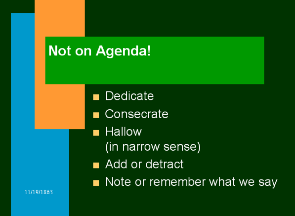
An excellent example of this very point was created by Peter Norvig in his Gettysburg Powerpoint Presentation. A humorous publication meant to poke fun at the mundane and downright awful uses PowerPoint has been put to, Norvig hits on many of the points made by Tufte.
 Of all the PowerPoint presentations I’ve been forced to sit through over my time as a student, this is possibly one of the most grotesque. The saddest part about these slides, however, is not that these colors were forced into one space, but that Norvig didn’t even have to create this himself. Yes, this horrid color combo was offered by the slideware program he used. Creators don’t even have to try and give their audience a headache, PowerPoint programs now do it for them.
 Another element Norvig included in his presentation that Tufte commented on in his article was the lack of word content. The slide above, chosen for no specific reason, gives a good example of what the other slides in the presentation looked like. The bullet points were short, lacking description, and did not follow much of a flow in terms of presentation quality. In addition, the use of punctuation (namely the exclamation points) was out of place and really not needed. We get it, you’re excited, but please, show it in your voice, not the slides.
On a side note, I decided to test out Tufte’s theory and see if 6 slides really do contain only 80 words. The count came out to 85, roughly, much less than I would have expected from 6 slides of supposed educational content.
Overall, I really enjoyed Norvig’s satirical creation, one powerpoint presentation I wasn’t bored to tears watching.
