
This week’s reading assignment, the Feltron reports, were not at all what I was expecting. I have to admit, when I heard what these were, I was expecting pages upon pages of excel sheets and boring charts and graphs of some pretty idiotic stuff. And while a few of the data sets are rather…interesting…the layout and presentation far exceeded my expectations.
Feltron.com – 2005 Annual Report
The first Feltron report that I looked at was the annual report for 2005, which can be accessed here. Among the various charts and graphs, Felton reported subjects like work vs. play, time spent abroad, and music and food preferences. The layout of Felton’s reports was very clear, colorful, and engaging. While a few of the graphs were a bit of an eyesore (such as the first graph charting work vs. play) and difficult to read, the data on the whole was presented in a very concise and playful way. Another aspect of this specific report that I enjoyed as a reader was the wide variety of charts used to display various information. Felton utilized maps, bar graphs, and pie charts in a way that explained his data very well.
Feltron.com – 2009 Annual Report
The second Feltron report I looked at was the annual report for 2009, which can be accessed here. After looking at Felton’s initial report, I was excited to see how he was able to expand and update his report just a few years later. Rather than improving upon his layout, however, I felt that Felton had taken quite a few steps back. The first thing that struck me was the size of the image on the screen. I’m not sure if this was the fault of Felton in posting the image file to the webpage, but the image size was far too large for the size of my browser screen. Now, instead of having two pages of data and charts displayed comfortably on the screen, I had to scroll back and forth and in some cases up and down the screen just to get a full picture of one graph or chart. Not exactly has accessible and clear as his earlier reports. Looking past the minor inconvenience of having to navigate my screen for one image, the graphs and charts themselves were not always the easiest to view or understand. One of the more difficult one’s to understand was the relationships graph.
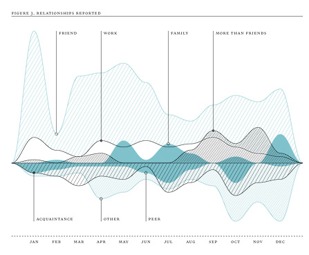 In this graph, Felton was charting the amount of people that answered what their specific relationship to Felton was. Ranging from drinking buddies to his ex-wife, Felton used a line graph to display the number of answers to each category, such as friend, family, work, etc. While the information was good and the line graph a good approach, in my opinion, I didn’t like this specific line graph. For me personally, having the lines displayed on either side of the middle line was confusing, although the different shading in between the lines helped a bit. Another part of the graph that was confusing was the lack of data points and information on the y-axis. Felton did display the months on the x-axis, which was slightly helpful in analyzing the data, the lack of measurements on the y-axis was confusing to say the least.
On the whole, however, I really enjoyed looking through Felton’s reports, as TMI as they were at times.