For this week’s discussion of digital history, we took a look at three seperate archives, all based upon recent U.S. historical events. Below is an analysis of their strengths and weaknesses, as well as a number of the styles and techniques they had in common.
The April 16th Archive: Digital Archive of the Virginia Tech Tragedy
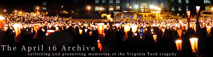
The first archive that I browsed through was the April 16th Archive, whose headline image is displayed above. As depicted above, this archive has collected images and texts related to the shootings at Virginia Tech. Below is a screen shot of the opening page of the archive:

For me personally, I felt the gray background of the webpage completely took over the space. Not only does the headline image only take up a third of the top of the page, the images displayed below it are lost in a sea of gray. While I think the designer was trying to go for a sobering color, I think it could have been done in a less all-consuming manner. Even adding in some of the school colors throughout the page would have been appropriate in my opinion (such as the box to the left of the image).
Going past the visual, I liked the way the information was broken up at the top. I was able to search through collections, get more information on the site, or return to the main page from any part of the archive. I specifically enjoyed the way the collection page was broken down into subsections, as shown below:

I was able to search through a variety of information (images, text, memorials) based upon victim, college, or special event). If I were a student doing research on the subject, I feel like I would be able to do a fairly decent job about capturing the reaction of those impacted by the tragedy, mostly in the form of images.
Another issue that I had with the page was its search method. When I went to the browse page, I was given the option of browsing by page or by tag. Because I didn’t see any sort of organization to the browsing by page, I chose to try the browsing by tag. This was possibly even more of a headache. The tags for the most part were extremely hard to read, and the enlargement of certain tags (most likely the most used) was distracting and seemed very odd visually. I would have preferred if they kept them all the same size and instead positioned them by most searched or used.
Overall, the layout of the archive was not visually appealing for me, and the search methods for the most part were not helpful. This archive definitely captures very moving and informing data, but for the purposes of real historical research, I would only be able to grasp the emotional rather than factual details, generally speaking.
Hurricane Digital Memory Bank
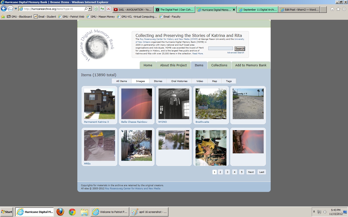
The next archive that I took a look at was the Hurricane Digital Memory Bank. This archive looks at two hurricanes that impacted the U.S specifically – Katrina and Rita. This is an image of the opening page of the archive:

Compared to the last archive, I saw an immediate change in the way the designers used the physical space provided. Not only was the space of the page fully taken by the design, the sides of the page were colored in gray, matching the ‘hurricane-themed’ coloring of the page (blues, greens, etc.). I also enjoyed that the entire first page was not taken up by the producers of the archive explaining the reason for the webpage. The information was clearly visible on the opening page, and if I wanted to view the information I was able to do so, but I was not overwhelmed with it.
Also, I felt that this archive did a better job of organizing the information displayed. I was easily able to browse through different document types (video, images, text, etc.), and the use of tags was not distracting or overwhelming, as seen below:
 The thumbnails of the searchable items was, in my mind, a great touch. Not only do I relate to things better in a visual way, when archiving events such as hurricanes and natural disasters, what impacts me the most or what I am most interested in seeing is the physical images of the data. Words, while important, can only go so far in informing me of a hurricane’s impact. This was an excellent touch that I think could have been very impactful in the April 16th Archive.
Another thing that I enjoyed about this archive was the amount of links it provided to other similar sites. I was able to link to archives done by the National Museum of American History and other reputable sources, which not only gave more credit to the legitimacy of the archive, but filled in any missing information I didn’t recieve from the Hurricane Memory Bank Archive. I would have liked to see more of this in the April 16th archive as well.
September 11th Digital Archive
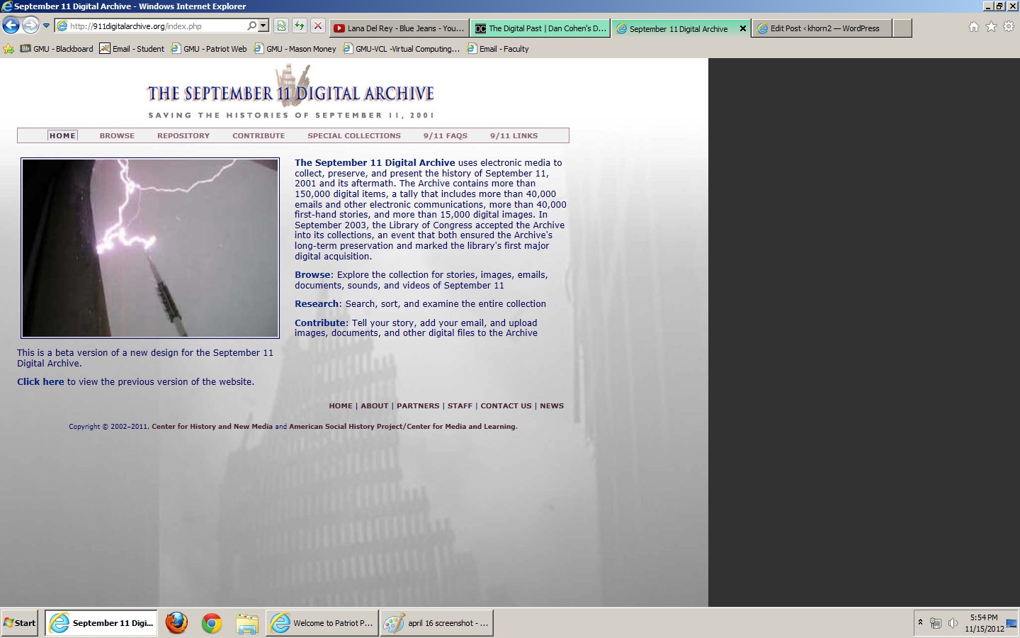
The last archive I looked through was the September 11th Archive, put together by many of the same designers of the Hurricane Memory Bank Archive. This definitely showed in the layout and overall design of the archive. Below is a screenshot of the opening page of the archive:

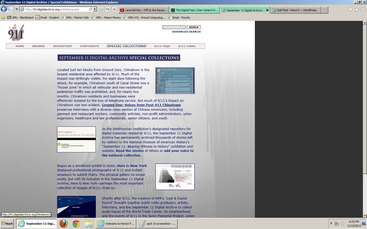
Again, I felt the colorscheme worked well for the purpose of the archive. I enjoyed that it wasn’t completely one color, that they placed a faded image of Ground Zero behind it. Also, by using a gray background instead of black, I felt that it stood out, at least for me personally, from the other 9/11 pages I have seen floating around on the web. One issue for me on the opening page was the awkward chunk of space on the right that only appears on this section of the archive. It looked to me like it was designed for a smaller display (and very well could have been, as it notes on the page that this is a beta version of a previous archive). Other than this small detail, I felt the initial page oriented me well for the archive.
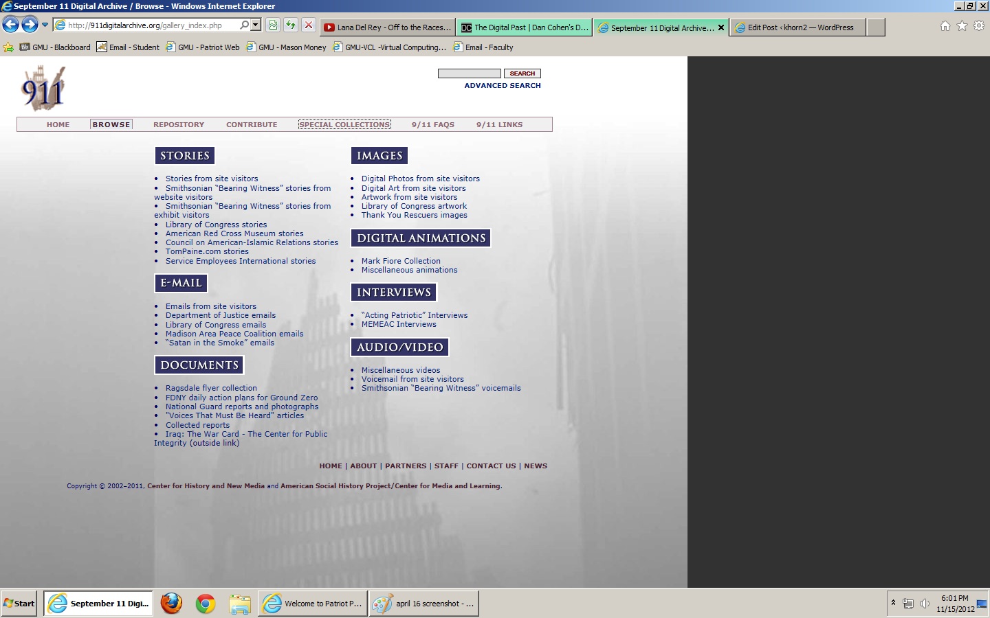
Another attribute of this archive that I saw in the Hurricane Memory Bank was the easy to browse information. The site provided a number of ways for me to browse through the given information, including by type as well as by collection, as displayed below:


This made it much easier for me to search for exactly what type of information I wanted to see, and resembled many war and government-related archives I have seen in the past, which was a nice touch (albiet propbably unintentional). It made it easier for my mind to associate what I was viewing and what its purpose was. Also, I enjoyed that the color scheme seemed to stay the same throughout the archive, and matched well with the patriotic feel of the site.
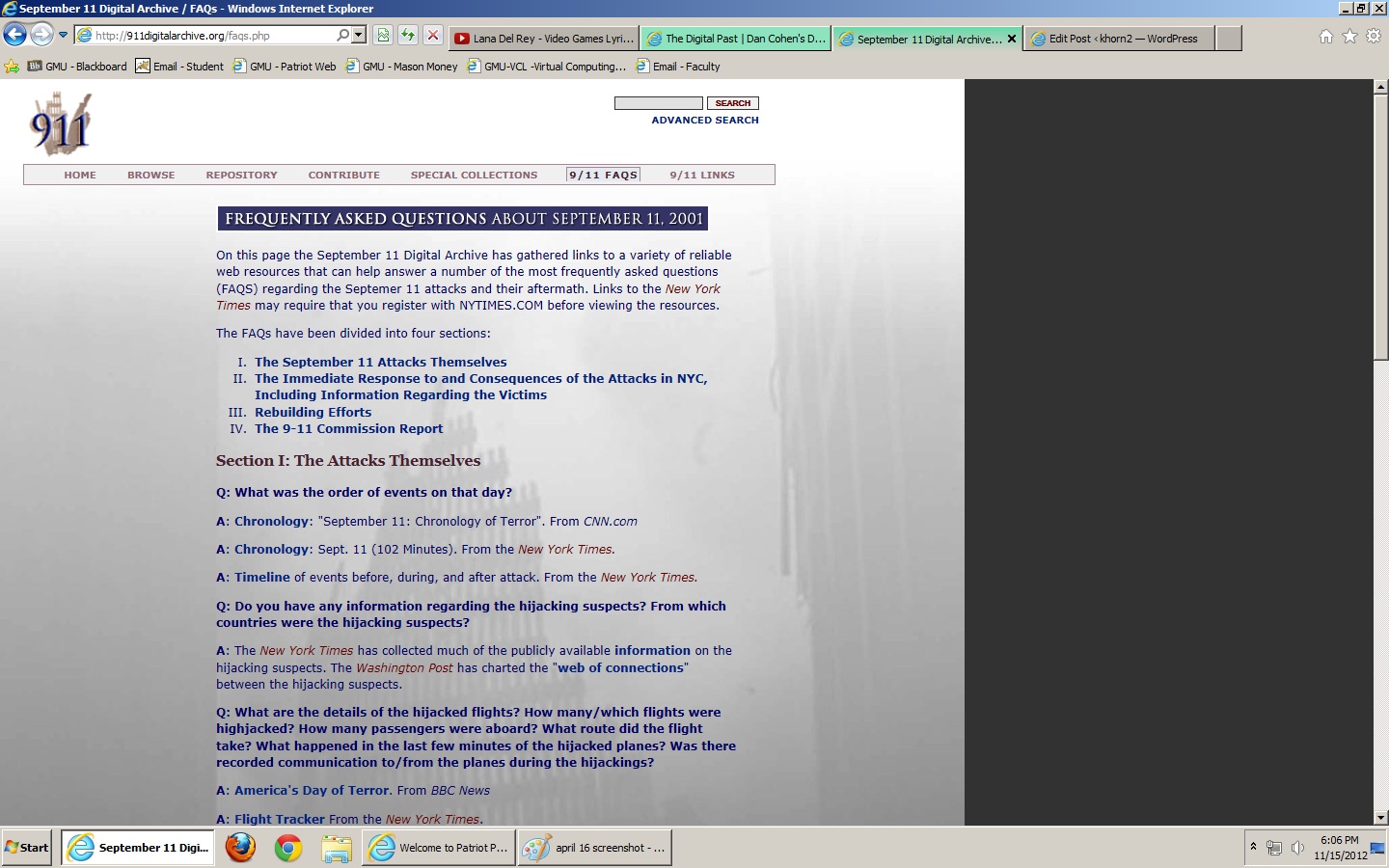
Another portion of the site that I really liked was the 9/11 FAQS page. While the April 16th Archive covers more of the emotional side of the tragedy, I felt that this archive covered both the emotional and factual evidence of the tragedy well. For the purposes of historical research, I felt that this archive provided enough resources to cover both aspects of the event.

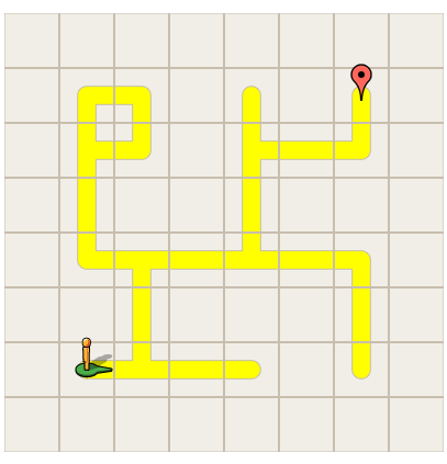
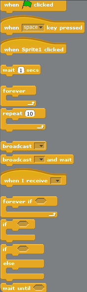
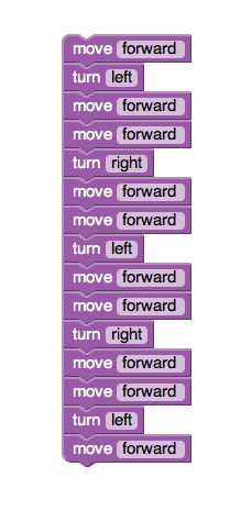 Granted, my code was very simplistic and the maze not very difficult to figure out logically, so that may have something to do with the ease of using this program. However, for a program newbie like me, this was a great way to get introduced to it all.
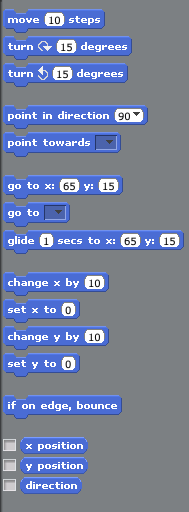
 In this box are eight different sections for controlling the characters in the program (which, in themselves, were also very complex – you could choose to load pre-existing characters or even create new ones! I chose to experiment using my roommates face, she loved it). Clicking on the various programs brought up various options, these: