Historical Chart: Map of the U.S. by Founding Date & Line Graph of Slaves Owned in Charles, MD

For this week’s assignment, I decided to create a chart that depicted the century in which each state was founded:

One of the downfalls of this map (or perhaps a downfall of me not being extremely familiar with Google Charts) is the lack of a legend to explain the coloring choices for this map. Given that information, I decided to include a short legend here –

  • Dark Green: States founded in the 20th Century
  • Medium Green: States founded in the 19th Century
  • Light Beige: States founded in the 18th Century
To create this chart, I went to Google Charts and choose the USA map from the list of given charts. This choice was a rather simple one, given that I wanted to depict information about the United States in a way that was visually appealing (probably influenced by the way I had seen it used in the Feltron reports). Once I picked the chart, I had to decide how I wanted to convey my given data. Because I wasn’t looking at very many data points (only three, really) I decided that a visual shading representation of the information would be a good approach. To represent this in the graph, I grouped the data points of each state according to which century they were founded in (i.e: data point ‘100’ was given to countries founded in the 20th century). By doing this, i created the difference in color shade that helped to visually group together the data points. While probably not the most scientific of approaches, it colored the map in a way that corresponded to the data that I wanted to convey.
If anyone knows of a way to create a legend on the map that I was using, please feel free to comment and let me know, I clearly wasn’t able to find it with my lack of technical prowess.

Also, here is the line graph depicting the number of slaves owned in Charles, MD from 1741-1809, using data pulled from Probing the Past:

Slaves Owned in Charles, MD from 1741-1809

Feltron Reports – TMI in a nice package

This week’s reading assignment, the Feltron reports, were not at all what I was expecting. I have to admit, when I heard what these were, I was expecting pages upon pages of excel sheets and boring charts and graphs of some pretty idiotic stuff. And while a few of the data sets are rather…interesting…the layout and presentation far exceeded my expectations.

Feltron.com – 2005 Annual Report 

The first Feltron report that I looked at was the annual report for 2005, which can be accessed here. Among the various charts and graphs, Felton reported subjects like work vs. play, time spent abroad, and music and food preferences. The layout of Felton’s reports was very clear, colorful, and engaging. While a few of the graphs were a bit of an eyesore (such as the first graph charting work vs. play) and difficult to read, the data on the whole was presented in a very concise and playful way. Another aspect of this specific report that I enjoyed as a reader was the wide variety of charts used to display various information. Felton utilized maps, bar graphs, and pie charts in a way that explained his data very well.

Feltron.com – 2009 Annual Report 

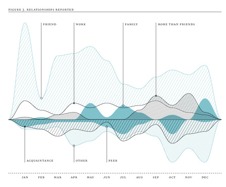
The second Feltron report I looked at was the annual report for 2009, which can be accessed here. After looking at Felton’s initial report, I was excited to see how he was able to expand and update his report just a few years later. Rather than improving upon his layout, however, I felt that Felton had taken quite a few steps back. The first thing that struck me was the size of the image on the screen. I’m not sure if this was the fault of Felton in posting the image file to the webpage, but the image size was far too large for the size of my browser screen. Now, instead of having two pages of data and charts displayed comfortably on the screen, I had to scroll back and forth and in some cases up and down the screen just to get a full picture of one graph or chart. Not exactly has accessible and clear as his earlier reports. Looking past the minor inconvenience of having to navigate my screen for one image, the graphs and charts themselves were not always the easiest to view or understand. One of the more difficult one’s to understand was the relationships graph.

 In this graph, Felton was charting the amount of people that answered what their specific relationship to Felton was. Ranging from drinking buddies to his ex-wife, Felton used a line graph to display the number of answers to each category, such as friend, family, work, etc. While the information was good and the line graph a good approach, in my opinion, I didn’t like this specific line graph. For me personally, having the lines displayed on either side of the middle line was confusing, although the different shading in between the lines helped a bit. Another part of the graph that was confusing was the lack of data points and information on the y-axis. Felton did display the months on the x-axis, which was slightly helpful in analyzing the data, the lack of measurements on the y-axis was confusing to say the least.

On the whole, however, I really enjoyed looking through Felton’s reports, as TMI as they were at times.

Historical Map Exercise – West Bank Settlements and Camps

For this week’s exercise, I created a map overlaying two separate maps, which can be found at the following two links:

Map of Israeli Settlements as of 1993 

Map of Palestinian Refugee Camps as of 2012 

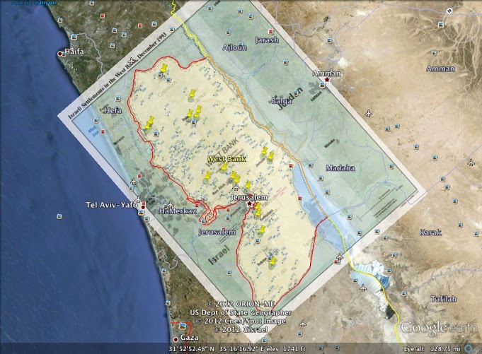
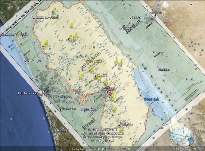
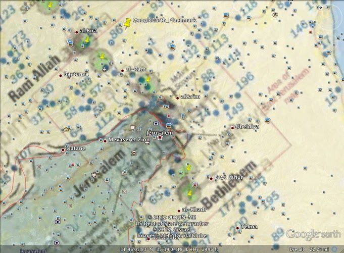
 For this map, I was trying to compare the number and location of Israeli Settlements created as of the 1993 Oslo Accords and the Palestinian Refugee Camps created as a result up to the year 2012. The following images of the created map show the location of the camps with yellow push-pin icons and the settlements as blue dots.

 The image above is an arial-like view of the map, showing a broad view of the West Bank. 

 The above image is a close-up of the West Bank map displayed previously, showing more clearly the clusters of settlements and refugee camps. 

 The above image is a close up on the area of Ramallah, Jerusalem, and Bethlehem, three cities that are central for both the Israeli and Palestinian people. Comparing this image with the others, it is clear that the number of settlements increases, in some cases encircling or blocking off refugee camps from one another.  


For the process of creating this map, I first thought through what I wanted to display to my audience. I had initially decided on showing the increase of settlements from 1993 to 2012, but could not find any concrete data that would be well displayed on a map. I decided instead to show the correlation and comparison between the number of settlements and refugee camps.

Once I had decided what information I wanted to display on my map, I found a separate map that displayed each aspect of what I wanted to show (the links for which are shown above). I first used the image overlay tool to display the first image, showing the Israeli settlements in blue dots. After I positioned the map and adjusted the translucency of the image, I worked on overlaying the second image, which displayed the location and number of the refugee camps. After I finished overlaying the image, I saw that the contrast between the two images was not very clear, and the refugee camps and settlements did not stand apart from one another on the map. Searching around the Google Earth tools for a bit, I found a push-pin tool that allowed to to show the location of the refugee camps in a way that would make them stand out from the other icons displayed on the map, resulting in the map images displayed above.

Overall, the Google Earth program was fun to use and explore. and allowed me to create many of the maps that I have seen before on other websites. I look forward to using it in the future and developing more skills through this class.


The Difference Slavery Made: Practical Example of Digitization Done Right

 This week’s reading, or rather exploration, of Will Thomas’s and Edward Ayer’s historical site, The Difference Slavery Made, was an excellent example of digitizing history in a way that is accessible and informative to a wide array of audiences.

In looking through the site, including the introduction and method pages, it was clear to me that the creators of the site kept the audience in mind, particularly in the ease of navigating the website. For example, the research for the topic of slavery in the Civil War included on this site covers a wide variety of factors and sources, so much so that it would be easy for a viewer of the site to become lost quickly. However, this site thought of a few ways to organize the information that made it less intimidating, as well as easy to search through for those with specific topics in mind.

 Sections of data in the image above are organized based on the topic they include

Sections of data in the image above are organized based on the format the information is relayed in 

As the two images from the site show, the creators of the site included numerous ways to search through their data, creating a practicality to the information as well as the ease for participation on the part of the viewer (one of the key goals of the site stated here).

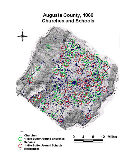
Another aspect of the site that I appreciated and felt added a level of professionalism to their work was the detailed data given in the form of images and maps. From a wide variety of subjects, as hinted at in the images above, Thomas and Ayers include a number of images and maps on their site, such as the one below:

 As shown in the map above, the data incorporated on this site usually includes multiple points of analysis and covers topics that I would not have even thought relevant to the topic of slavery, such as soil type.

In addition to the data included on the site, the interface and searchability of the site are key in making the information easy and accesible to viewers. Under the tools section, viewers can see which articles they have or have not read concerning a given topic, search through data by subject or format easily, as well as view the citation for various sources quickly.

This site was by far one of the more viewer-friendly and data inclusive that I have seen in the course of this class, and is one of the better examples of historical digitization I have seen while at Mason.

All Things Google: Your Documents, Your Way

This week’s reading was all about Google Documents, something that as a college student I am very familiar with – making the material a nice break after midterms. Listed below are the basic sections under Google that were discussed:

  1. Spreadsheets
  2. Charts
  3. Maps

Spreadsheets: 

Out of the subsections of Google discussed in the readings (taken from Google Tutorials available here), this is a pretty straight forward app, much like the rest of those offered through Google. Spreadsheets can be used to create files for work, organize personal data, or a wide range of other activities. Also, as with other programs on Google, creators can edit their spreadsheets as well as share them with others for viewing only or for editing purposes.  Also, preexisting spreadsheets can be uploaded to Google Docs to make sharing and editing easier and faster.

Charts: 

Included within spreadsheets, charts can be inserted to an existing or newly created spreadsheet to give a visual for the data contained in the document. One of the things that I found neat about Google Docs is that you can format and choose what type of chart you would like to place in your spreadsheet. There is a page you can pick from, broken down into style and type of chart available. And, should none of these charts appeal to you, you can go ahead and create your own.

Maps 

The final section discussed in this section of the reading was maps, one that I am not too familiar with outside of Google Earth or maps.google. Similar to the spreadsheet and chart functions within Google Docs (specifically Google Earth), maps allows a Google user to create a visual digitized map of anything they would like. One thing that was interesting to me was that this isn’t just some simple map that you could create through Paint on any PC, with insertable icons and clip arts that make a map or image look cartoonish and unprofessional. Using KML, discussed in further detail in this reading, Google Earth allows users to search for locations all around the world and add layers to their maps, including oceans, weather, buildings, and roads. This is the section that I am most looking forward to  studying and using in this course as it is the one that I have little to no familiarity with outside of searching for directions using my GPS.

Self-Evaluation: Practice What You Peruse

I have to admit, prior to reading this week’s assignments, I thought I had a pretty good grasp on internet security. Don’t use your social security number as a password, don’t open emails from people you don’t know, and especially don’t post personal information to social websites. I thought I was in the clear. Wrong. Putting myself in Matt Honen’s shoes, I found many, many things to change about the way that I use the internet and create and maintain my personal sites.

Basic Security: Steps Towards a Safer Tomorrow 

In the George Mason University ‘Computer Security‘ page, the IT Department offers a list of useful and highly recommended steps to take towards securing your computer’s information:

  1. Activate a Password Protected ScreenSaver
  2. Use Strong Passwords for All of Your Accounts
  3. Automatically Receive Critical Updates
  4. Verify Antivirus Software is Configured Properly
  5. Use Anti-Spyware Software
  6. Unique Passwords for All User Accounts
  7. Back up files weekly

Out of these seven helpful hints and suggestions, I can say I only honestly only follow the first three. As a college student with college age friends, you learn the easy way that a computer left unattended is a computer hacked, the first site most often gone to being Facebook. I’ve had many a status expressing my undying love for small fuzzy rodents and my desire to pursue my dream of yodeling posted under my name, neither of which is true (especially the yodeling part…). So, in order to physically protect my computer, I placed a password protected screensaver on my Mac to deter the potential hooligans. In addition to protecting my information physically, I also have gotten into the habit of using strong passwords for all of my accounts. As the daughter of a security analyst and programmer for the government, this one came as a no brainer. All of my passwords contain both numbers, letters, and symbols, at least 8 characters in length. If someone is going to hack into my account, I wanna make em work for it. Finally, I always set up new applications or existing files with the option to receive critical updates. One important one I always look out for is the changing of my passwords. If it doesn’t match up with my own account of reality, obviously something is wrong.

Aside from these, however, I really do a horrible job at protecting my information, a shocking and terrifying thing to realize writing a blog post for a gen ed class at 3 in the morning. One thing that stood out to me in the Basic Security reading was the use of unique passwords for all accounts. While I knew it was a bad idea to use the same password for all of your accounts (doesn’t take a genius to figure that out, really), I hadn’t realized that my 2-password option wasn’t much better. While it may be a pain in the neck at first, holding a separate password for each account you access will be beneficial in the long run in terms of protecting your identity and your personal information.

Having been thoroughly terrified by this week’s reading, I’m looking forward to implementing a few of these new security techniques to ensure that my information stays right where it belongs, in my hands.

The Epic Hacking of Matt Honen

iCloud 9: Not All Its Cracked Up to Be 

This week’s readings were by far the most interesting and the most terrifying. As an avid user of the internet, including a majority of Apple applications and products, the story of Matt Honen’s epic hacking scared me senseless. I thought to myself, “If this can happen to a technological journalist like Honen, how can any of us regular folk be kept safe?”. That’s just it though, according to Honen, none of us, not even gurus like himself, are ever truly safe from hacking.

In the discussion of his virtual attack, Honen discussed what is referred to as the Cloud. A cloud can be defined as the use of computing resources that are delivered over networks, such as the internet. It is through this ‘device’ that your cool technological gadgets can be linked and synced to operate in harmony with ease. It was precisely this harmony, however, that let to Honen’s worst nightmare. While the cloud has its obvious advantages, the cloud-based systems require different security measures to be put in place in order to protect users in the same way as they were before the onset of the cloud. It was through this source that the hackers who ruined 25% of Honen’s data forever were able to receive his billing address and last four digits of his credit card number, the exact two pieces of information they needed to rework his entire digital life. Scary, huh?

The most terrifying part of this story, however, is not the fact that it happened. Honen was not the first person to be facing this dilemma and he will not be the last. Rather, it was the motive behind the hackers attack that most worried and frightened me. The hackers had no greater motive to perform such an act than the use of Honen’s twitter account name, which one of the hackers wanted. If they went through all of this ‘trouble’ simply to get a twitter name, what will others be willing to endure to receive far more than that, say, banking and financial information? A truly scary thought.

Behind Enemy Lines: A Rescue Mission for Matt

While his story is indeed terrifying and cautionary, all hope was not lost. Surprisingly, it was the same function that allowed the hackers access that eventually restored 75% of Honen’s personal files, the cloud. Through a company specializing in restoring lost data, Honen was able to get back his most valuable data, the photographs of his daughter and family memories stored digitally on his hard drive. Great reward, however, comes at a price, specifically to the tune of around $1.600. While you can’t place a price on retrieving life memories, restoring all of that data places a heavy price on your wallet.

Where Honen Went Wrong: What Not to Do With Your Data 

Honen’s story of his epic hacking is no doubt terrifying. However, there is more to take away from this than sleepless nights and nightmares of vaporized data. Honen is quick to list several things that he could have done to prevent the hacking, placing a portion of the blame on himself, where I believe it rightfully belongs. In short, a few things to do:

  • Back it up: Don’t think your information on your hard drive is permanent or safe. Back up your information one a week
  • Utilize Strong Passwords: No, abc123 is not an effective or secure password
  • Create Unique Passwords: Just like every account and username is unique, so should your passwords be. If a hacker can get one password in a matter of seconds, you leave them only a matter of minutes to ruin your entire digital life


Archive Team: We Are Going to Rescue Your Stuff…Ethically?

When I first looked at the Archive Team site, I was convinced that there was some form of copyright violation going on. From my years of schooling and forced copyright informative courses, my first glance at this site had by illegality senses tingling. I have to admit, after browsing the site I am still not sure which camp I reside in, but the discussion below shows a few reasons why I think this site could be illegal, but not necessarily unethical.

Copyright Law: What Is and Isn’t Covered

According to the George Mason University Copyright Office PowerPoint presentation, entitled “The Basics“, copyrightable work is defined as an original expression that appears in tangible form. As such, this would not include: titles, facts, names, short phrases, or ideas. Also not included under copyright is what is known as Public Domain. This includes work that is: non-protected, lost copyright, abandoned works, expired copyright, or federal government works. Within these lists, the one that stands out most for the purposes of analyzing the Archive Team site was the ‘abandoned works’ and ‘facts’ sections.

Taking the issue of abandoned works, I would say that the majority of what appears on the Archive Team site is from other webpages on the internet that have shut down or abandoned their sites entirely. One example of this is the MobileMe project being pursued on the site. When the site shut down on June 30th, 2012, the Archive Team had a wide variety of information on their site concerning the old Apple application. Another area of the copyright issue is that of facts. According to the copyright presentation by George Mason University, facts are not protected under copyright law. As such, any historical fact presented on the Archive Team site, such as facts that could come from appropriate webpage information, would not be copyrightable. Having said this, however, it seemed to me that most of the information presented would not fall under that category, although there were definitely a few exceptions.

While I have listed two possible exceptions, the majority of the Public Domain qualifications don’t apply. Taking the lists from above, the information that appears on the Archive Team site, in my mind, should not be allowed. Yes, some of these sites are being abandoned, but not all. One example of this is the starwars.yahoo.com archived data. This site, which was held on Yahoo for a period of time, contained the information on the movie series, as well as the information shared by users of the site. When Yahoo gave a 30 day notice of the closing, Archive Team was quick to jump on the page and start collecting data. While the Archive Team site indicates this information came from that page, technically giving credit to Yahoo, I do not feel that this would fall under something that would be considered Public Domain, especially considering the information is no more than 4 years old.

Illegal? Sure. Unethical? Not So Fast

While I have presented information that would put this website on the boarder line of illegality, I do not believe that it is, in nature, unethical. Taking the definition of unethical as being morally reprehensible, I do not feel that this site is taking the information it collects for improper use. It is my opinion that this information is being used to educate the wider public. While this would not count under the TEACH Act of copyright law, morally it is not a crime to inform the general population on information that would otherwise be made unavailable. So while it would appear that in the initial glance of this site the Archive Team was engaging in illegal activity regarding the copyright law, much of the information on the site is questionable as to its copyright protection, and the main use of education places the issue of legality into a gray area as far as I am concerned.